Plotting a nice y-axis and cropping figures
I was getting lost when editing the post about US measles cases data and so decided recently to cut that post in two. The one on measles is about .. measles. Here, I discuss some code I use to make the y-axis in R figures look a bit better than it does by default. I also show a function for cropping results.
Making a nice y-axis for plots
The following is a function that I adapted from another I found somewhere on the web (Stack Overflow, almost surely). There is most likely a prettier way to do this, but this one works.
make_y_axis <- function(yrange) {
y_max <- yrange[2]
if (y_max < 10000) { # Do almost nothing (label with ab,cde if >1,000)
factor <- 1
ticks <- pretty(yrange)
labels <- format(ticks, big.mark=",", scientific=FALSE)
} else if (y_max < 1000000) { # Label with K
factor <- 1/1000
ticks <- pretty(yrange*factor)
labels <- paste(ticks,"K",sep="")
} else if (y_max < 1000000000) { # Label with M
factor <- 1/1000000
ticks <- pretty(yrange*factor)
labels <- paste(ticks,"M",sep="")
} else { # Label with B
factor <- 1/1000000000
ticks <- pretty(yrange\*factor)
labels <- paste(ticks,"B",sep="")
}

# Remove 0unit, if it's there, just have 0

if ("0K" %in% labels) {
labels[which(labels=="0K")]="0"
}
if ("0M" %in% labels) {
labels[which(labels=="0M")]="0"
}
if ("0B" %in% labels) {
labels[which(labels=="0B")]="0"
}
y_axis <- list(factor=factor,ticks=ticks,labels=labels)
return(y_axis)
}
To make the function easier to use, I also use a modified plot function.
# PLOT_HR_YAXIS

#

# Plot data using a human readable y-axis

plot_hr_yaxis <- function(x, y, ...) {
y_range = range(y, na.rm = TRUE)
y_axis <- make_y_axis(y_range)
plot(x,y\*y_axis$factor,
       yaxt = "n", ...)
  axis(2, at = y_axis$ticks,
labels = y_axis$labels,
las = 1, cex.axis=0.8)
return(y_axis)
}
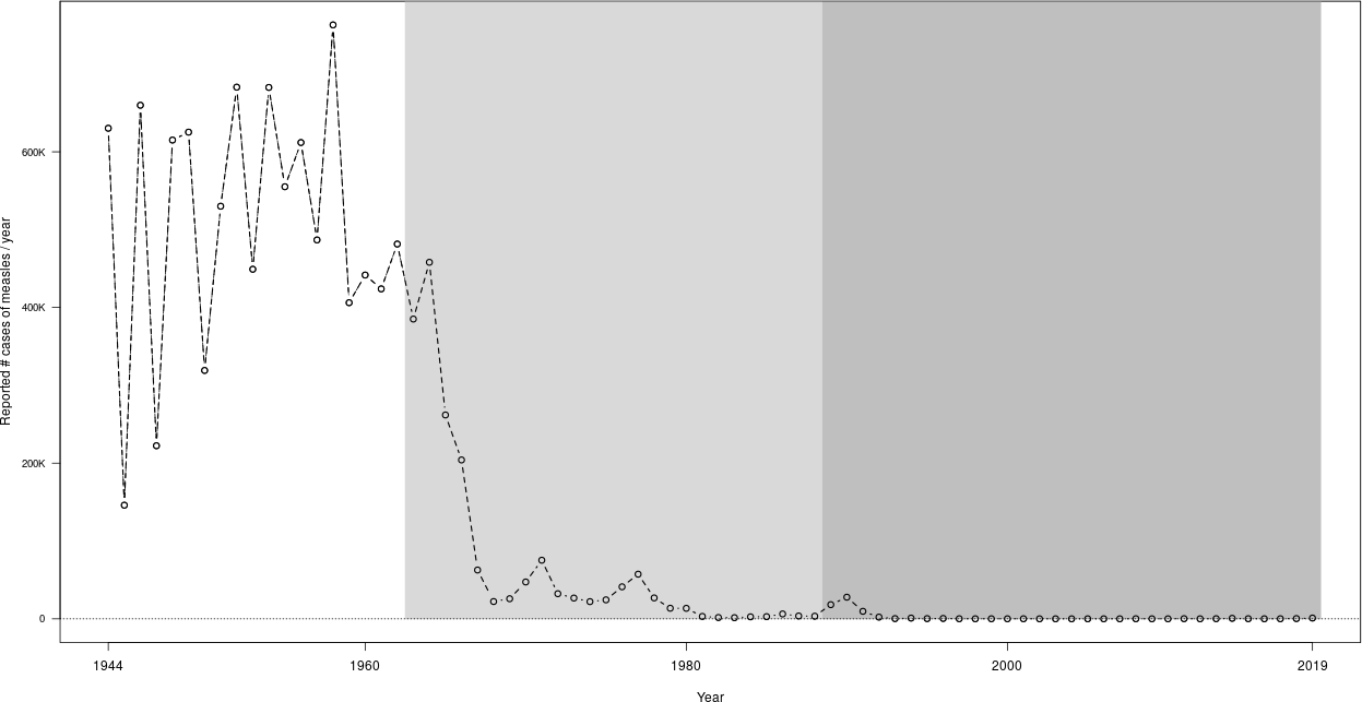
The function plot_hr_yaxis returns the parameters for the modified y-axis, so that they can be further used in the plot. To use this function, you need to call it on your data. I show the use with the code for the first of the two plots in the post US measles cases data. The data frame measles contains the loaded measles data.
png(file = "measles_US_1944_2019.png",
width = 1280, height = 720)
y_axis <- plot_hr_yaxis(measles$year, measles$reported_cases,
type = "b", lwd=1, lty = 2,
xlab = "Year",
ylab = "Reported # cases of measles / year",
xaxt = "n")
axis(1, at = c(1944,1960,1980,2000,2019))

# Vaccination started in 1963

polygon(x = c(1962.5,max(measles$year)+0.5,max(measles$year)+0.5,1962.5),
y = c(0,0,par("usr")[4],par("usr")[4]),
col = "grey85", border = "grey85")

# Recommended second dose started in 1989

polygon(x = c(1988.5,max(measles$year)+0.5,max(measles$year)+0.5,1988.5),
y = c(0,0,par("usr")[4],par("usr")[4]),
col = "grey75", border = "grey75")

# Redraw stuff covered by the polygons

abline (h=0, lty = 3)
abline (h=par("usr")[4])
abline (v=par("usr")[2])
lines(measles$year, measles$reported_cases\*y_axis$factor,
type = "b", lwd=1.5, lty = 2)
dev.off()
Note that here, the call to polygon does not involve the “real” y-axis, just the coordinates obtained from par("usr"). In general, one would have to multiply all $y$ values by y_axis$factor, as is done in the call to lines at the end of the code block.
This gives the first figure in the post US measles cases data, reproduced here for convenience.

Cropping pdf and png results
The following function is called with the same file name as used for the plot output just after the call to dev.off(). Of course, this requires to have functioning pdftk and convert program line commands available. (Windows people: it can be done. Not my problem here. Maybe I will explain elsewhere.)
crop_figure = function(fileFull) {
fileName = tools::file_path_sans_ext(fileFull)
fileExt = tools::file_ext(fileFull)
if (fileExt == "pdf") {
command_str = sprintf("pdfcrop %s",fileFull)
system(command_str)
command_str = sprintf("mv %s-crop.pdf %s.pdf",fileName,fileFull)
system(command_str)
}
if (fileExt == "png") {
command_str = sprintf("convert %s -trim %s-trim.png",fileFull,fileName)
system(command_str)
command_str = sprintf("mv %s-trim.png %s",fileName,fileFull)
system(command_str)
}
}
Enjoy Reading This Article?
Here are some more articles you might like to read next: