Spatio-temporal spread of COVID-19: considerations and modelling
The paper I briefly present here together with some of the code used to generate figures, was published as “Describing, Modelling and Forecasting the Spatial and Temporal Spread of COVID-19: A Short Review” in Fields Institute Communications 85:25-51 (2022). It can be downloaded here or from my webpage here. An older version is available on arXiv here.
In the paper, I review several different aspects.
- The general context of mathematical models of the spatio-temporal spread of infectious pathogens.
- The details of how the first wave (mostly) of COVID-19 spread.
- Some spatio-temporal models that were considered specifically for COVID-19.
Refer to the paper for details. Here, I describe how the data was gathered and the figures were produced.
Collecting data on initial spread
There are different sources for case data, but my favourite when considering the world-level situation is the one curated by JHSSE. I have an R script that pulls the data and performs basic pre-processing. This script is in turn called by a short bash script that runs in cron, so that data pulling happens every day. Note that the data on initial spread is not concerned by this pull operation, I am just detailing this point here for completeness.
The JHSSE site is, understandably, concerned about the current and future evolution of COVID-19 and thus the data on the initial spread needs to be investigated further. For this, I relied on a combination of Wikipedia and Google News search, threw in some GISAID data..
The TSA data
If you have initiated an public airplane trip in the USA in the past few years, you know the system. For those who have not, here is how things work. From the unsecured area in an airport, the first security check involves showing your boarding pass and an identification document to a Transportation Security Administration (TSA) officer who verifies both before allowing you to proceed with the remainder of the checks (baggage and body scan, etc.) to admit you into the secure zone of the airport.
When considering air travel, this data is very interesting. Indeed, one is checked only in the first airport of a trip, regardless of the number of connecting flights taken; this means that the data is quite representative of the number of trips initiated in the USA on a given day. The TSA records how many of these checks happen and reports this data openly; it is available here.
Interestingly, the data is provided “shifted”, i.e., the year to year difference is shown in terms of corresponding day of the week. Comparing, say, 3 January 2021 (a Sunday) and 3 January 2022 (a Monday) makes little sense. However, this means that while the table can be consumed “as is” for a plot comparing yearly numbers of checks, it also needs to be processed a little before being stored or used for anything not straightforward. This is further required because of the presentation of the table, which has the latest data posted as the top row, decreasing dates, then wraps around and has the next missing date as the last day. For instance, writing this on 15 February, the table has 14 February as its top row, decreasing days, then has 16 February as its last row (because 16 February 16 corresponds to 15 February last year).
So let us dig into this data. First, the basics. Let us grab the data and clean it.
# Grab the data

tsa = htmltab::htmltab("https://www.tsa.gov/coronavirus/passenger-throughput",
which = 1, rm_nodata_cols = FALSE)

# Slight change of column names for convenience

colnames(tsa) = c("date", "vol2022", "vol2021", "vol2020", "vol2019")

# Get rid of thousands separators, make numbers

for (c in c("vol2022","vol2021","vol2020","vol2019")) {
tsa[[c]] = gsub(pattern = ",", replacement = "", x = tsa[[c]])
tsa[[c]] = as.numeric(tsa[[c]])
}

# Make dates proper

tsa$date = lubridate::mdy(tsa$date)
If we want to plot things with the latest day in the data as the first day, things are easy. Note that we use the “axis prettyfier” that I presented here.
# Get range of values to plot and compute pretty y axis

y_min = min(tsa[,2:5], na.rm = TRUE)
y_max = max(tsa[,2:5], na.rm = TRUE)
y_range = make_y_axis(c(y_min, y_max))

# Make a colour palette

my_palette = sprintf("dodgerblue%d", 2:4)

# Start the plot. Plot 2019

plot(tsa$date, tsa$vol2019*y_range$factor, type = "l",
ylim = c(y_min,y_max)*y_range$factor,
lwd = 2, col = "red",
xaxs = "i", yaxt = "n",
xlab = "Month", ylab = "Travellers screened")

# Plot remaining years

for (y in 2020:2022) {
vol_y = sprintf("vol%d", y)
lines(tsa$date, tsa[[vol_y]]*y_range$factor,
lwd = 2, col = my_palette[2023-y])
}

# Throw in the axis, legend..

axis(side = 2, at = y_range$ticks, labels = y_range$labels, las = 1)
legend(x = "bottomright", legend = c("2019", "2020", "2021", "2022"),
lty = c(1,1,1,1), lwd = c(2,2,2,2),
col = c("red", my_palette),
inset = 0.01)
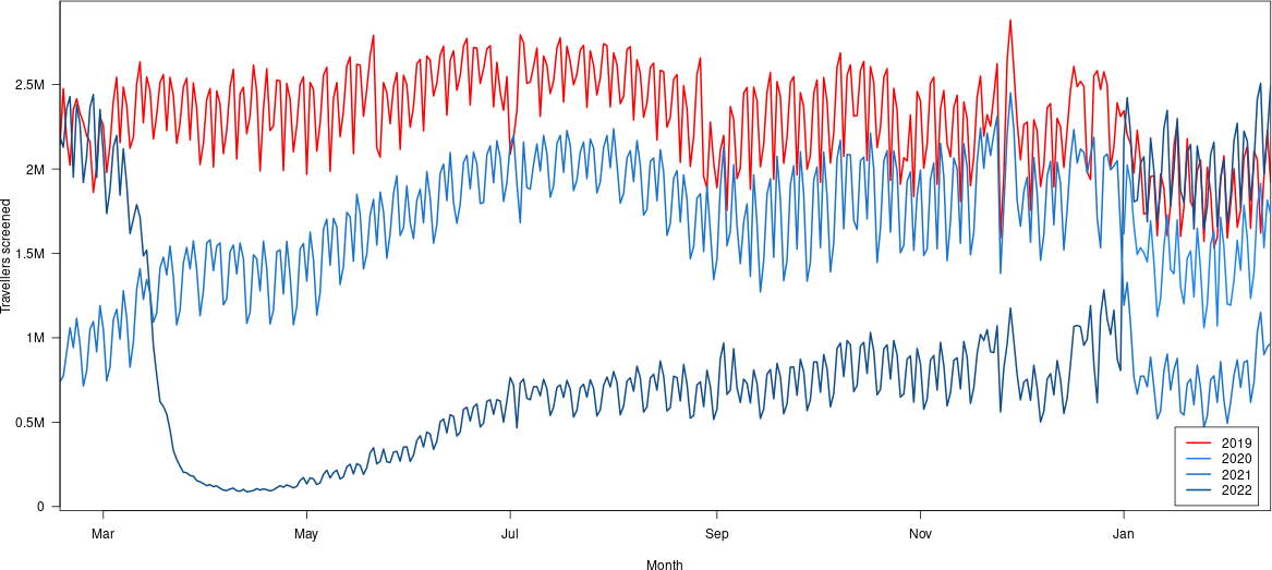
Okay, this is a little confusing. The most recent data is in the top right, the blue curve over the red one.
Things become a little hairier if one wants to, say, plot all the data in sequence rather than in parallel, i.e., plot all dates from 2019 to today. Of course, the table provided by the TSA is itself created from data that is in the format we want, but as far as I am able to tell, the table we downloaded earlier is the only way for the public to access that data. (If anybody knows if the data is on an Open Data server such as data.gov in unedited form, drop me an email.)
To get a sense of what needs to be done, let us first look at several interesting places in the table: the top (the most recent data points), the switching point between calendar years and the bottom (with the soon to be filled information). Looking at the situation today (15 February 2022), this is what we have.
| date | vol2022 | vol2021 | vol2020 | vol2019 |
|---|---|---|---|---|
| 2022-02-14 | 1731473 | 967693 | 2494922 | 1922613 |
| 2022-02-13 | 1815824 | 946458 | 2198657 | 2227730 |
| 2022-02-12 | 1534080 | 900696 | 1972248 | 1950385 |
| 2022-02-11 | 1914374 | 1151420 | 2507588 | 1620239 |
| 2022-01-02 | 2023309 | 1327289 | 2422272 | 2202111 |
| 2022-01-01 | 1616316 | 1192881 | 2178656 | 2345103 |
| 2021-12-31 | NA | 1650795 | 805990 | 2311732 |
| 2021-12-30 | NA | 2049604 | 874406 | 2392331 |
| 2021-02-19 | NA | 1059452 | 2429489 | 2022861 |
| 2021-02-18 | NA | 914823 | 2358511 | 2177690 |
| 2021-02-17 | NA | 773422 | 2129862 | 2476445 |
| 2021-02-16 | NA | 738825 | 2190300 | 2147045 |
My interpretation (which could very well be wrong) of this table is the following. The days in 2022 (until the point where the 2022 column starts to contains NA) are the “real” week days. 2022-02-14, for instance, was a Monday. Then in the remaining columns on that row, we find the closest Monday: in 2021, this was 2021-02-15, in 2020, 2020-02-17 (yay for leap years!) and in 2019, 2020-02-18.
Then, once the 2022 column starts to contain NAs because the data points would be in the future, the same becomes true with the 2021 dates remaining. But this leaves some questions:
- How was 2020-02-29 dealt with?
- How are years patched together?
- Can the overall time series be recomposed by taking the rows from vol2022 from 2022-02-14 to 2022-01-01, ten the rows from vol2021 from 2021-120-31 to 2021-02-16, then the rows from vol2021 from 2022-02-14 to 2022-01-01, etc.?
Altogether: it would be really nice if the TSA put the time series on data.gov! In the meantime, let us assemble the data in sequence and accept the fact that there probably will be issues with the exact dates.
# Find 1 January in dates

idx_Jan01 = which(tsa$date == lubridate::ymd("2022-01-01"))

# Where we will store the result

tsa.ts = c()

# Assume all year cutoffs are at the same point on each row

for (c in 2:5) {
tsa.ts = c(tsa.ts, tsa[idx_Jan01+1:dim(tsa)[1], c])
tsa.ts = c(tsa.ts, tsa[1:idx_Jan01, c])
}

# Get rid of the NAs we put in there..

tsa.ts = tsa.ts[!is.na(tsa.ts)]

# Make a data frame

tsa.ts = data.frame(
date = seq(tsa$date[1]-length(tsa.ts)+1, tsa$date[1], by = "day"),
value = rev(tsa.ts[!is.na(tsa.ts)]))
Let us plot the result. We will add a moving average, so define the following function.
ma <- function(x, n = 7, sides = 1) {
stats::filter(x, rep(1/n, n), sides = sides)
}
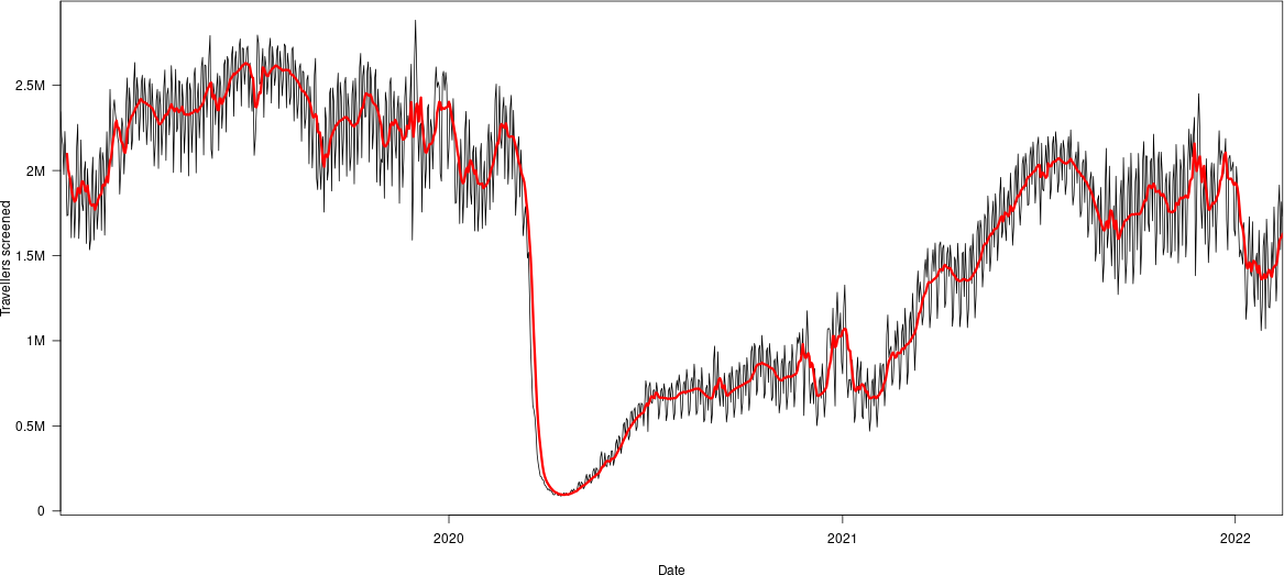
Note that we specify that the filter function is the one from the stats library (the default one). This is important in case we use the dplyr library, which redefines the function. We get the following figure, in which the red is the moving average

Whether the cutoffs are appropriate remains to be seen..
Enjoy Reading This Article?
Here are some more articles you might like to read next: